I was approached in early March by Dublin agency, Boys and Girls, about being the featured artist for this year's Irish 'Tapas Trail' sponsored by Spanish wine, Campo Viejo.
The project involved 2 main elements:
1. 'Tapas Trail' maps for the 2 two Irish cities, Dublin and Cork, each featuring 4 restaurants.
2. Four specially commissioned prints to be featured in the 4 restaurants for both Dublin and Cork.
1. 'Tapas Trail' maps for the 2 two Irish cities, Dublin and Cork, each featuring 4 restaurants.
2. Four specially commissioned prints to be featured in the 4 restaurants for both Dublin and Cork.
I’ve been a big fan of Joan Miró’s work following a visit to the great Spanish artist’s studio on Majorca. For me the dominant white backgrounds and intense colours really hold the flavour and spirit of Spain. When I look at his work I see strong sunlight reflecting off buildings and hard lines between light and shade. In Ireland we get used to seeing the world around us devoid of intense light and shadow. There’s a softness often seen in Irish landscapes, exemplified by Paul Henry’s paintings for instance.
Part 1 - 'Tapas Trail' maps for Dublin & Cork
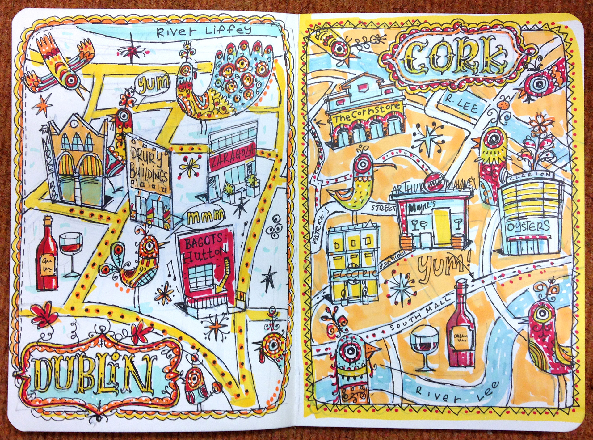
These are my initial ideas for the maps. I decided not to go with the coloured background as it was more difficult of the 2 to read and also the white background had more of a Spanish feel to it. Some of the birds had to be killed off, the client requested Spanish guitars, flamenco dancers and a Spanish looking waiter in their place.
For this project I wanted to bring some of the essence of ‘Miró’s España’ to my palette. I’d also been shown photos of a wonderful brightly coloured sculpture by Spanish street artists Remed & Okuda, located in the Campo Viejo vineyards. It was these colours I most wanted to reflect in my work, to link directly to the source of the Campo Viejo grape.
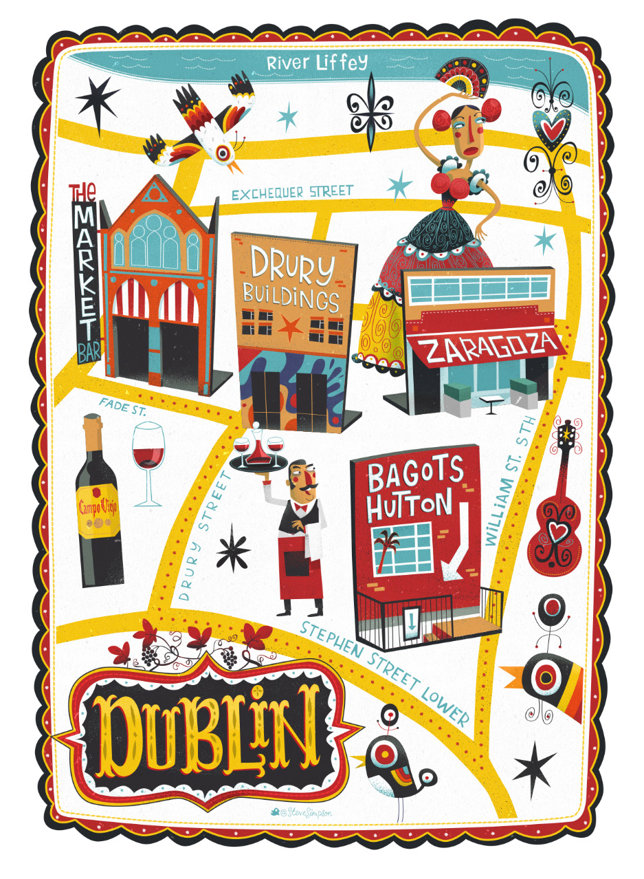
Tapas trail map for Dublin showing the 4 featured restaurants
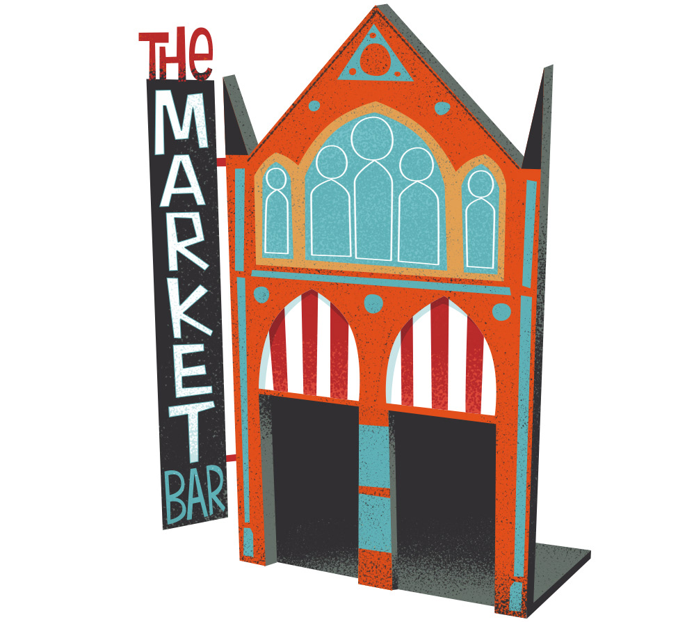
The Market Bar in Dublin

Tapas trail map for Cork showing the 4 restaurants

Arthur Mayne's in Cork
Part 2 - Four commissioned prints to be featured in the restaurants.
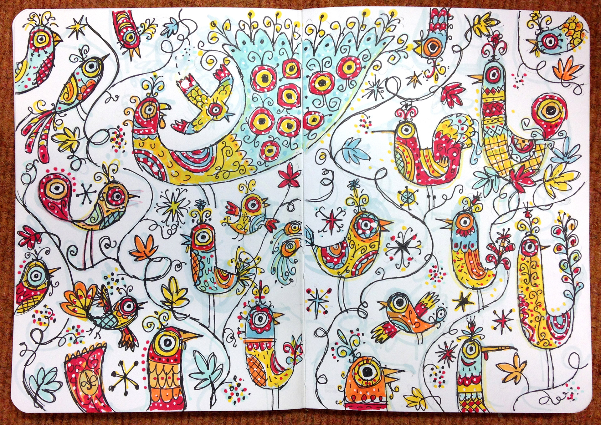
These are my initial sketches for the prints. A few of these birds survive in the final artwork, however most, including the peacock in particular, was seen as more associated with Portugal than Spain.
(I do really like peacocks and will eventually find a project to put one in:)
Most of my work begins life in my sketchbooks, that’s where ideas start to germinate. It’s always a matter of drawing, drawing and re-drawing again until the best ideas start to emerge. Once I’m happy with the rough design I will scan it and use it as a base for my colour artwork which I create using Photoshop.
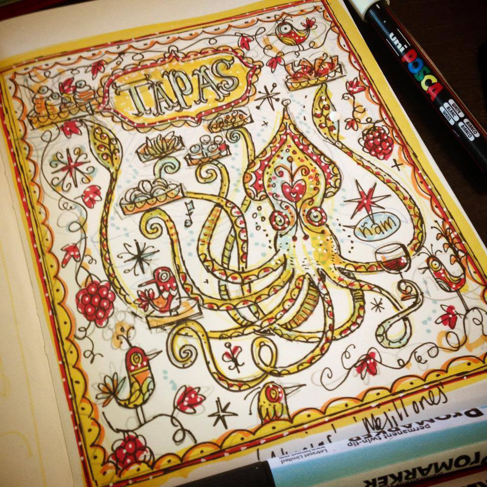
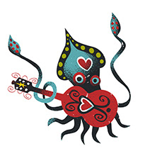
All 4 illustrations were worked up in my sketchbook - squid
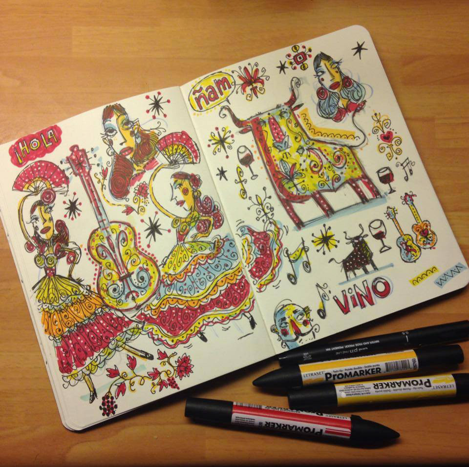
The brief called for 4 individual images based on the words, ‘Guitar’, ‘Bull’, ‘Flamenco’ and ‘Tapas’. These would come together to make one large piece of art. This required quite a bit of pre-planning, each image needed to be individual enough to work on its own and yet the colours, shapes and complexity of the four needed to be balanced when brought together. There was also the small detail of getting them to join seamlessly like one giant tapestry or jigsaw puzzle.
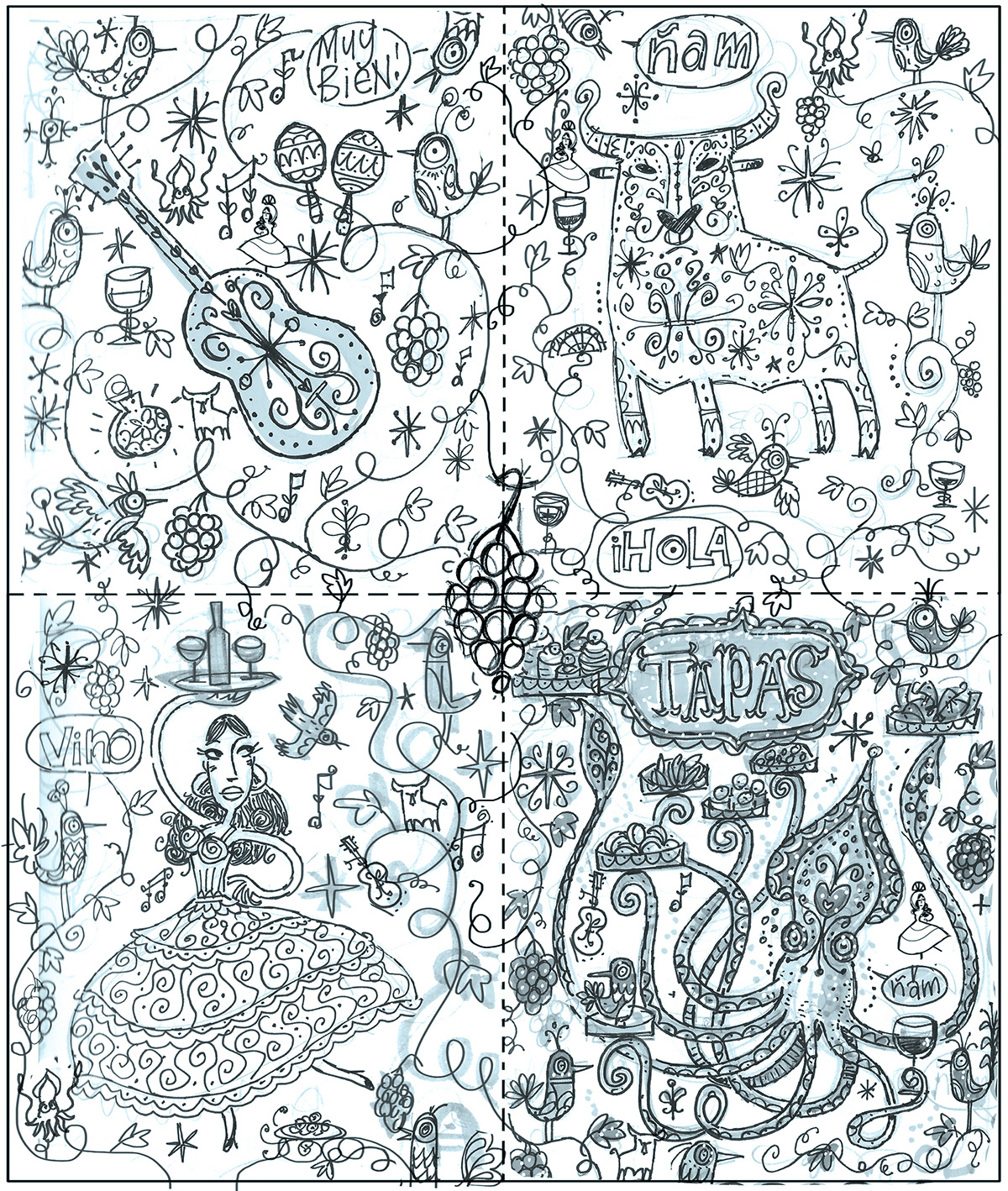
I scanned the pencils into Photoshop and roughly tried to work out how they would fit together. As each of 4 pieces need to be printed at around 36 inches deep, which meant the full peice would be too large to work on as a single file and would need to be assembled later.
Each of the 4 quadrants were editioned (25) and signed as given away as gifts at the launch in Dublin
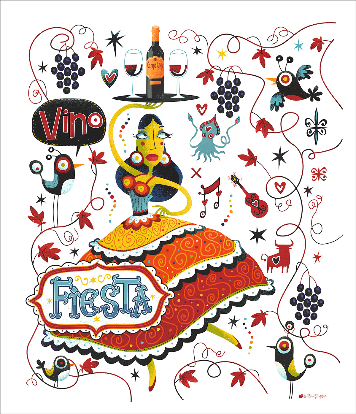
'Fiesta'
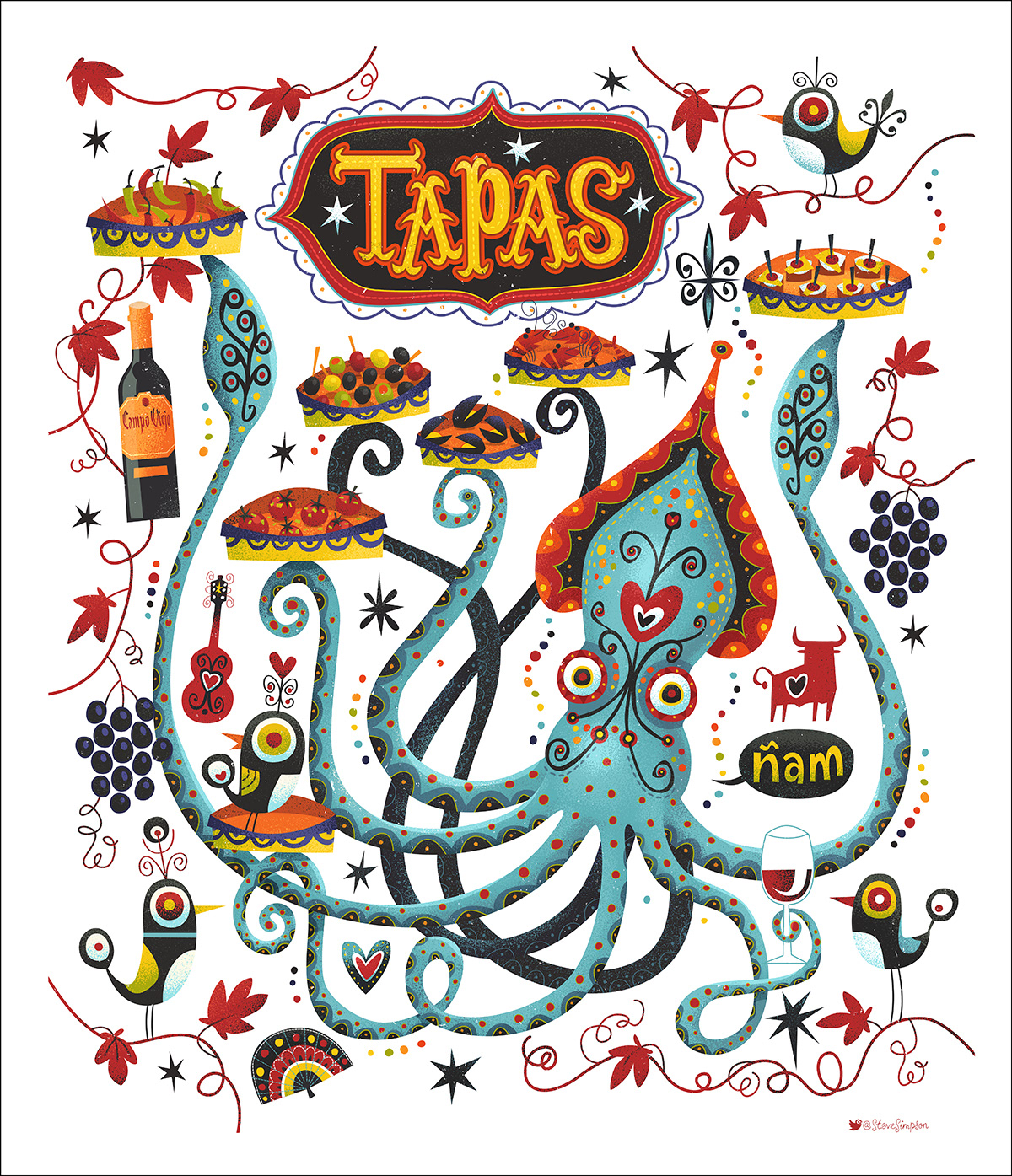
'Tapas'
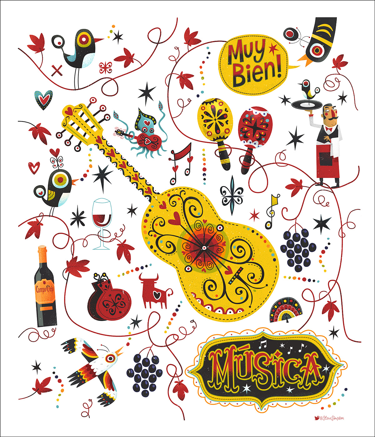
'Música'
I particularly like the miniature squid playing guitar in this one:)
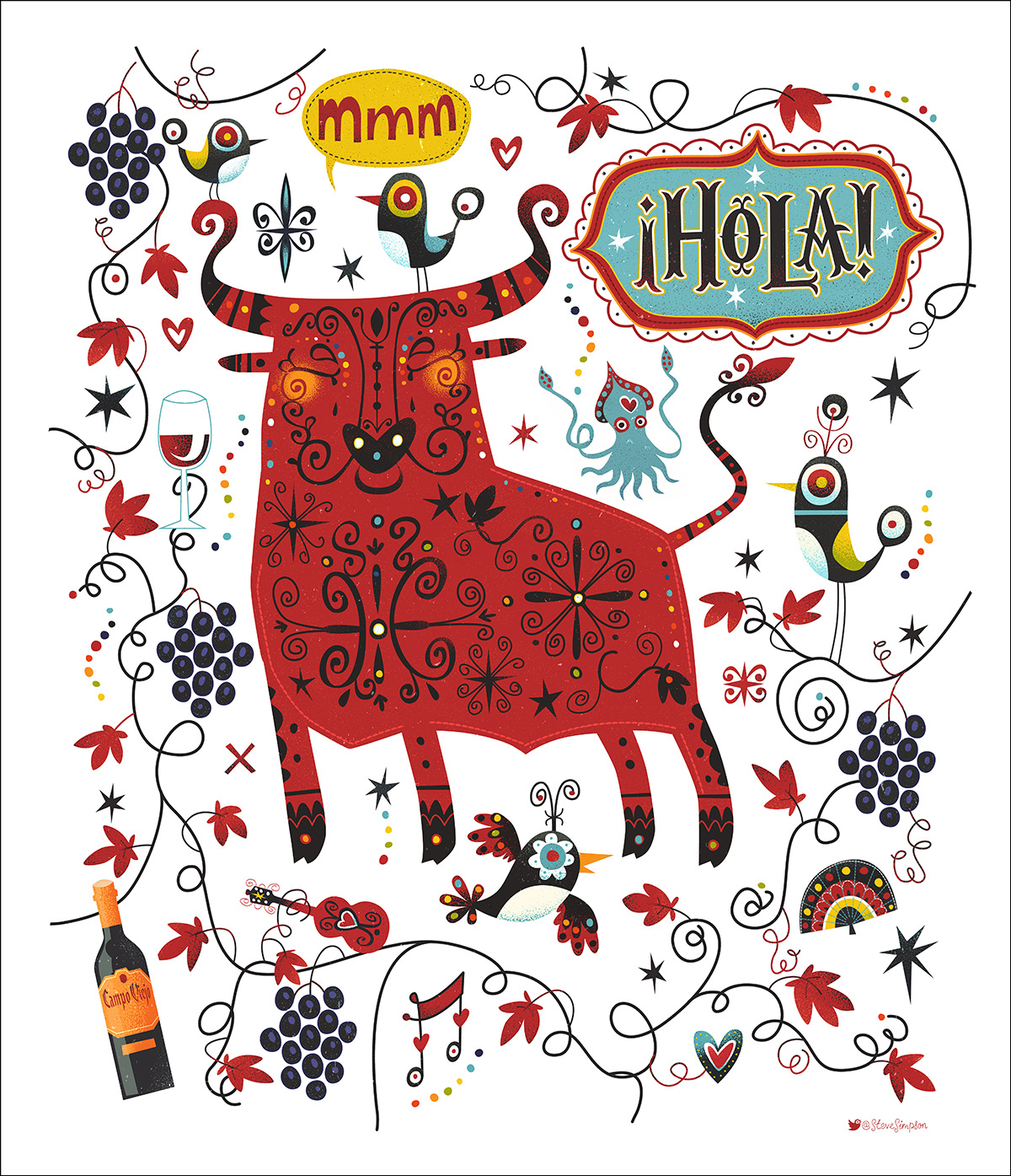
'¡Hola!'
(this bull has never been anywhere near a bull ring!)
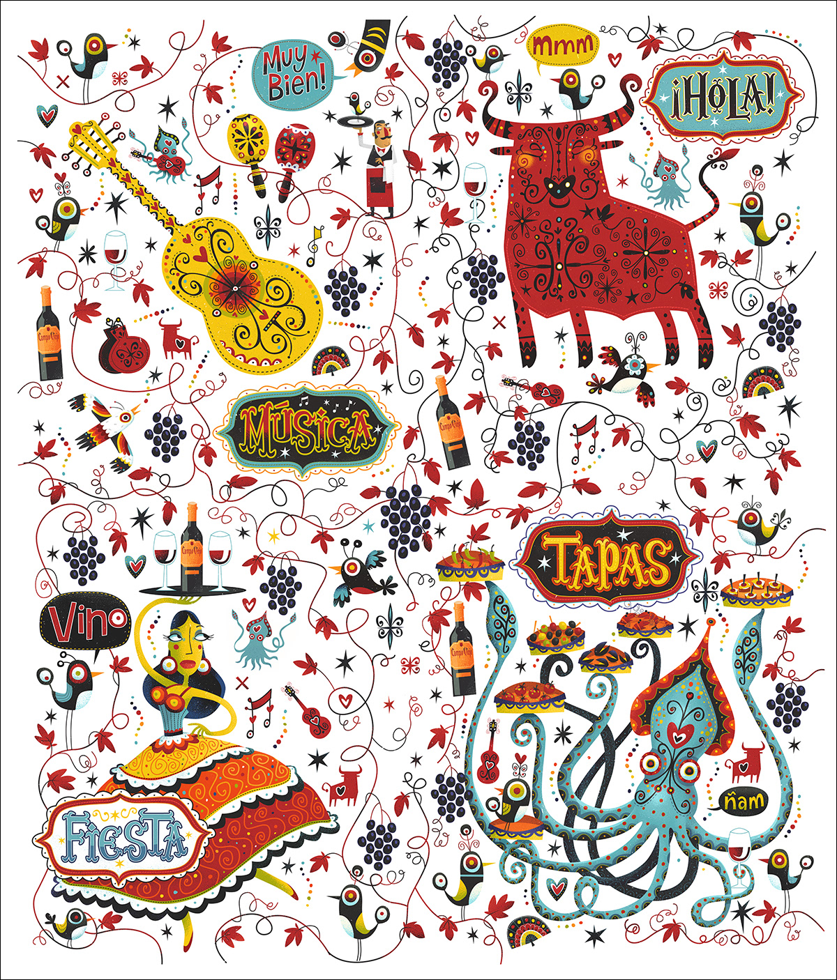
The 4 prints come together to make one big print
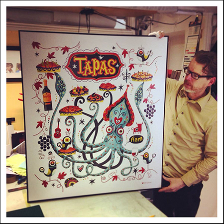
Each of the restaurants featured a large print of one of the Quadrants